image tool
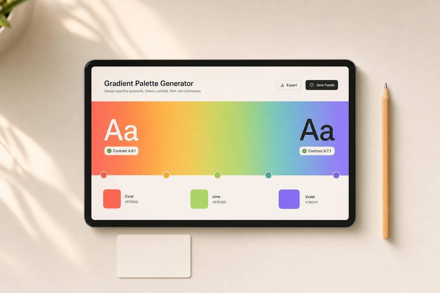

A gradient palette works best when I plan the layout, colors, stops, direction, and text contrast before export. If I skip that step, the gradient may look fine on its own but fail behind text, icons, or GIF motion.
Here’s the short version:
A few numbers matter here. Social graphics often use sizes like 1,080 × 1,080 px, 1,080 × 1,920 px, and 1,280 × 720 px. And if I’m making a GIF, fewer stops can help cut banding, noise, and file bloat.
The core idea is simple: plan the gradient like part of the layout, not like an afterthought. That means saving the hex codes, stop positions, gradient type, and angle so I can use the same setup again without guessing.
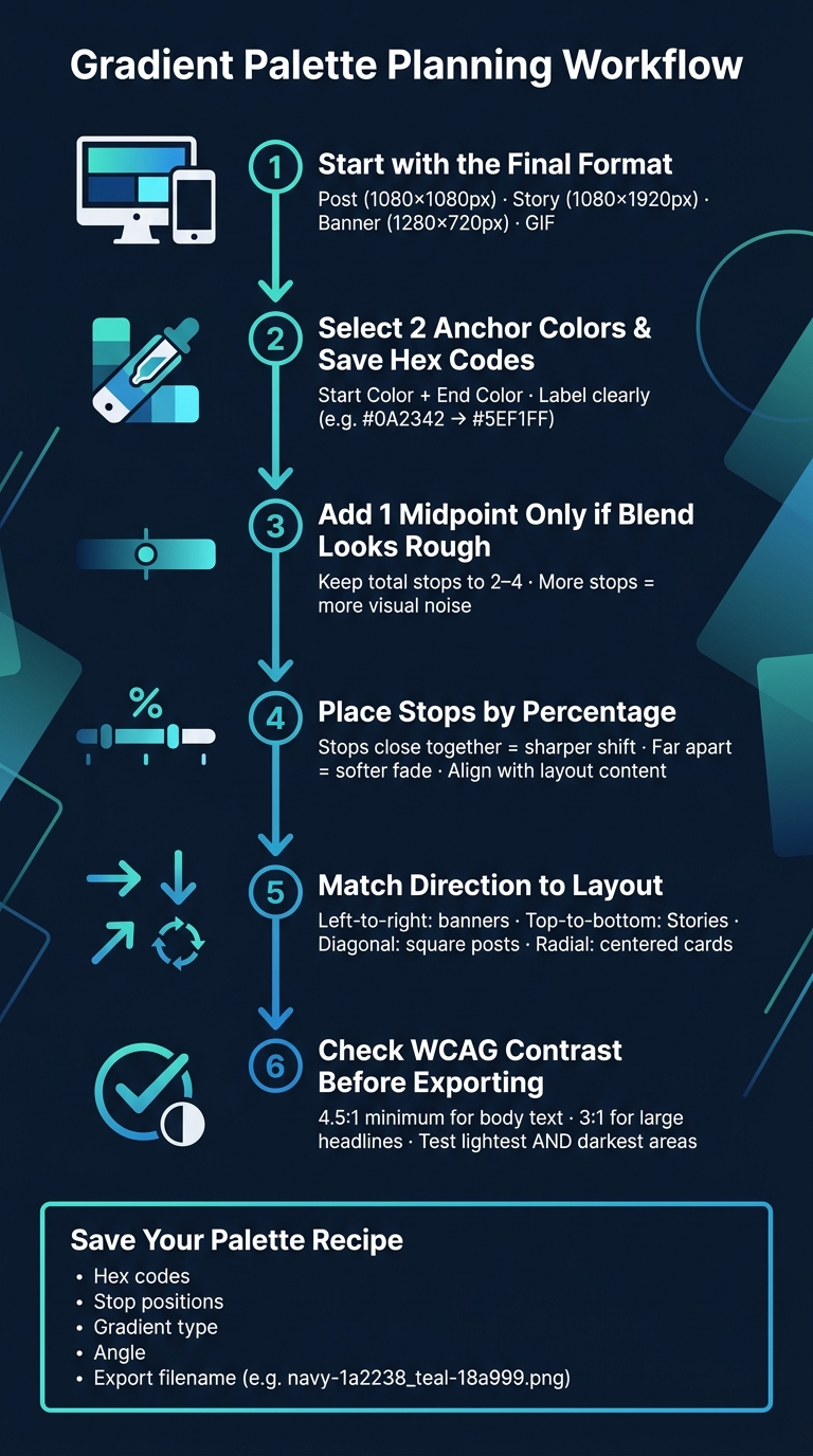
Gradient Palette Planning: Step-by-Step Workflow
The two anchor colors you choose - your start color and your end color - shape the whole gradient. Pick these first, because every stop builds from them.
A dark base plus a lighter accent usually works well. For example, a deep navy like #0A2342 with a soft aqua like #5EF1FF gives you a gradient that feels consistent across social graphics, GIF backgrounds, and simple web graphics. If you want a gentler blend, stay with similar hues. If you want more contrast, go with opposite-leaning hues.
Once you land on a pair that looks right, save both hex codes right away. A hex code is a six-digit color value, like #FF6A00. If you save #0B1020 as your start and #4D9FFF as your end, you can rebuild that same gradient later without second-guessing yourself.
A basic note file or shared brand doc is enough. Just label the colors clearly - use names like Gradient Start and Gradient End instead of vague labels like “blue” or “dark blue.” You can also test the pair in ROCKIMG's SVG Gradient Generator to enter the hex codes, preview the blend, and export an SVG or raster file.
| Graphic Type | Color Strategy | Example Hex Pair |
|---|---|---|
| Quote card | Soft blend, similar lightness | #3A4A5A → #BFD7EA |
| Promotional graphic | High contrast, bold hue shift | #1B0449 → #FF2E86 |
| GIF background | Clean transition, moderate saturation | #1E9FA3 → #B9F3F5 |
Different graphic types call for different anchor pairs. Quote cards tend to look better with softer anchors. Promotional graphics can handle more contrast. GIF backgrounds usually work best with cleaner, middle-range anchors.
For GIFs in particular, watch out for heavy saturation or abrupt jumps in brightness. Those can lead to banding and noise after export.
Here’s a simple check that saves headaches later: if text or icons will sit on top of the gradient, test contrast at both the lightest and darkest ends. WCAG guidelines recommend a minimum contrast ratio of 4.5:1 for regular text and 3:1 for large headlines. If either anchor misses that mark with your text color, tweak that anchor’s brightness before you start adding midpoints.
With the anchors locked in, the next step is choosing midpoints and deciding how many stops the gradient needs.
Once your anchor colors are in place, add a midpoint only if the transition feels rough. A two-stop gradient can look clean and deliberate. But when the gap between the start and end colors is big, the blend can drift through muddy or abrupt tones. That’s when a midpoint helps.
A midpoint color stop is an extra color placed between the start and end stops. Instead of letting the tool blend straight from one color to the other, you give it a clear handoff point.
This works best when the two anchor colors are far apart in hue or brightness. For example, a direct blend from #FF0000 red to #0000FF blue can create muddy transitions. Adding a planned purple midpoint like #8000FF gives you a cleaner red → purple → blue blend. A black-to-white gradient can also use a mid-gray midpoint to cut banding and smooth the fade.
Pick the midpoint with care. Use a hex code from your brand palette, or dial it in with a color picker or HSL controls so the middle color doesn’t collapse into a washed-out tone.
For most social posts and simple graphics, 2–4 stops is the sweet spot. Two stops are often the cleanest option. One extra stop can add a bit of depth or bring in a brand accent without making the palette feel crowded.
If the jump between colors is large, start with one midpoint. Add a second only if the blend still feels rough. More than four stops usually adds visual noise, especially on small screens or in compressed images. For GIF backgrounds and lightweight animations, fewer stops can also help reduce banding and keep file sizes smaller.
Stop position, shown as a percentage from 0% to 100%, controls where the blend changes fastest. Stops placed close together make the shift sharper. Stops placed farther apart make the fade softer.
For example, stops at 0%, 20%, and 100% create a faster shift near the start of the gradient, which can pull attention to a corner or edge of a design. Stops at 0%, 50%, and 100% create a more even blend that works well behind longer text or product images.
If text, logos, or icons sit on top of the gradient, line up the stops with the layout first. Keep the area under key content fairly steady in brightness and saturation. And don’t place a sharp transition right under small text or thin icons. If your headline sits in the center of the card, move a bright midpoint closer to 65% instead of 50% so the reading area stays smoother. Keep your main content over the calmest part of the gradient.
Once the stops feel right, set the direction and preview the palette in the browser tool.
Once your stop positions are locked in, direction decides where the color shift shows up in the design. At this stage, it helps to preview the palette inside the actual layout. That way, direction and contrast can be checked together instead of in isolation.
Linear gradients move in a straight line. A left-to-right linear gradient tends to work well for wide banners and headers. A top-to-bottom gradient fits vertical mobile formats like Stories, where content flows from top to bottom. A diagonal gradient can add a bit of motion to square social posts and promo graphics.
Radial gradients spread out from a center point. That makes them a good match for centered card graphics, badges, avatars, and spotlight-style visuals. If your main focal point is an icon or avatar in the middle of the frame, a radial gradient pulls the eye inward instead of guiding it across the layout. You can also nudge the center slightly off-center for a softer glow that feels less rigid.
| Layout Type | Gradient Style | Direction |
|---|---|---|
| Vertical mobile post or Story | Linear | Top-to-bottom |
| Horizontal banner | Linear | Left-to-right or diagonal |
| Centered card or badge | Radial | From center |
| Square social post | Linear or diagonal | 45° or 135° |
For GIFs, stick with a simple linear sweep. In basic graphics, radial gradients can give you a soft glow in the middle, but linear gradients are often the safer pick when the design has labels or several elements competing for space.
Once the direction fits the layout, check that same palette with your actual text or icons in place.
After the direction is set, test the gradient behind real content before exporting anything. Check white and black text against both the lightest and darkest parts of the gradient. Thin icons and fine lines tend to disappear faster than big headings, so look at those closely.
A gradient can look fine in a full-size preview and still fall apart at thumbnail size. So it’s worth doing a quick check at social-media scale too. If the contrast feels weak, move a stop or darken the palette until the text is easy to read.
When the preview looks clean, export the palette for social posts, GIFs, or simple graphics.
Once the contrast check passes, the palette is ready to move beyond the browser. Export the gradient and save the hex codes so you can bring back the same look later.
For social posts and simple graphics, export the gradient as a flat background first. A square post can use 1080×1080 px, a vertical Story can use 1080×1920 px, and a YouTube thumbnail can use 1280×720 px.
Save the start color, end color, midpoints, and stop positions together. That set becomes the repeatable recipe for the palette. Name the file with the anchor colors, such as navy-1a2238_teal-18a999.png. Then reuse those saved codes in ROCKIMG tools for overlays, borders, and text accents.
For quote cards and promo graphics, use the gradient as a full-bleed background. Place text on the calmest part of the gradient, or put a subtle text box behind it.
For GIFs, keep the palette simple and the background fixed. GIFs compress better with two or three stops and soft transitions.
Keep the gradient static across frames. If text slides in, an icon pulses, or a caption fades, let those moving parts do the work. The gradient should hold the frame together in the background.
Changing the background color from frame to frame adds visual noise without adding meaning. It can also make the file larger. In ROCKIMG's GIF tools, keep the gradient as a fixed base layer and animate only the text or icons.
A good gradient palette should be easy to use again and again. That gets much easier when you lock in the final use, exact hex codes, midpoint stops, stop count, direction, and contrast before you export.
Once the palette is set, save the specs right away. Copy the hex codes, stop positions, gradient type, and angle into a notes file or style guide as soon as you finish. It also helps to use an export filename that includes the colors, so you can spot the right version at a glance.
Don’t judge the gradient only by the part that stands out most in the preview. Check the lowest-contrast area too. Text has to work in the weakest spot, not just the prettiest one.
Keep contrast at 4.5:1 for normal text and 3:1 for large text. If the text still feels hard to read, simplify the gradient until it’s clear.
After readability is confirmed, save the hex codes and stop positions so you can reuse the palette in ROCKIMG graphics, GIFs, social posts, and simple graphics.
Keep your start and end colors in the same temperature family: warm with warm, cool with cool. Pairing neighboring hues like sage and mocha, or warm beige and dusty blue, usually gives you a calmer, more intentional gradient.
If you need to dial in exact shades, use the ROCKIMG Image Color Picker to pull colors from existing graphics. Then place your color stops across the 0% to 100% range so the transition feels smooth instead of choppy.
Place your stops so the area behind the text stays high-contrast and easy to read. In most cases, soft transitions work better than harsh shifts.
To cut down on visual noise, keep your stops in the same temperature family. For example, use warm shades together or cool shades together. Then space those stops across the 0% to 100% range so you can find a balanced spot for text.
Simple gradients tend to work better in GIFs because they keep file size lower and help cut down on visual artifacts. When a gradient gets too complex, with lots of color stops, the GIF usually becomes larger and less efficient.
A lighter touch works best here. Using fewer color stops or colors that sit close together on the spectrum can help the animation look smooth and balanced without adding extra weight, which matters when you're sharing it on social platforms.