image tool
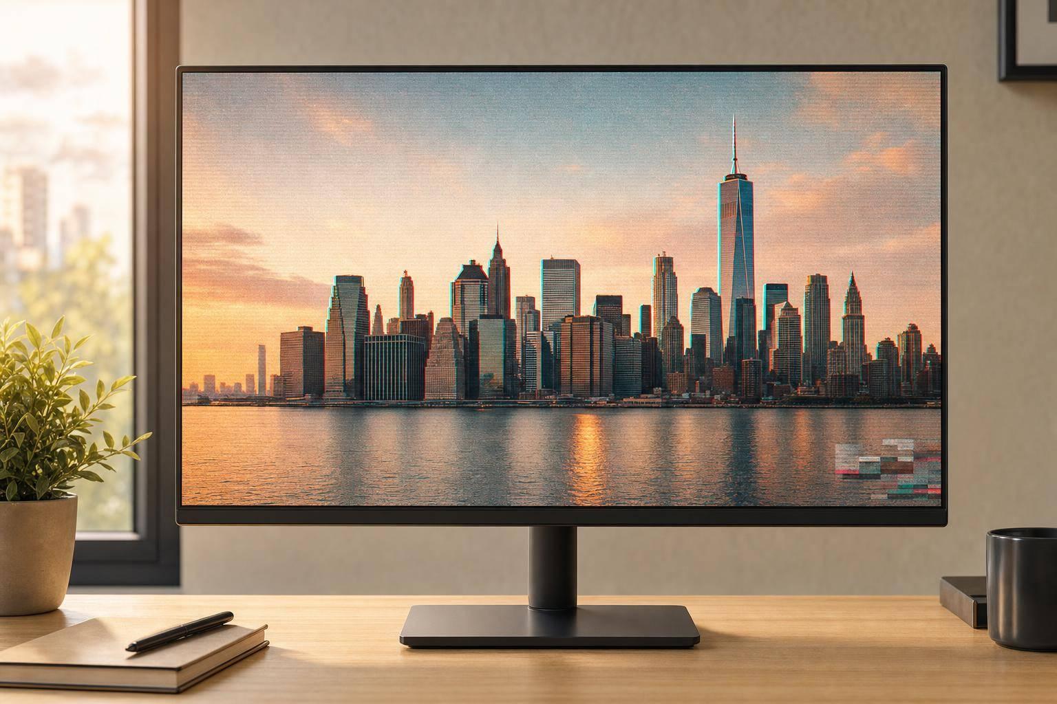

A glitch effect works best when I keep it light, stack it in the right order, and export at the final size.
If I want a photo to look broken on purpose without losing the subject, I start with a clean, high-contrast image. Then I build the look in layers: noise, RGB shift, scan lines, and signal damage. For most posts, 5%–20% noise, 1–5 px RGB shift, and scan lines under 30% are enough. If text, faces, or the first few words get hard to read, I’ve gone too far.
Here’s the short version:
If I want the effect to look sharp instead of messy, I set the image up first, use low settings first, and check both full size and thumbnail view before exporting.
Before you touch the effect controls, get the image ready first. That small bit of setup helps the glitch look cleaner, sharper, and more intentional. It also helps noise, RGB shift, scan lines, and signal damage hold up after export instead of turning into a blurry mess.
Start with images that have strong contrast and clean edges, like portraits, cityscapes, or product shots. Those sharper outlines make RGB shift stand out more. If the image is too soft or packed with detail everywhere, the effect can get muddy fast.
Crop and resize before you add any effects. If you resize afterward, noise and scan lines can blur, and RGB fringes can lose their bite.
A few common sizes work well:
In ROCKIMG, crop to your target ratio, center the subject, and set the final size before opening the glitch tools.
It also helps to bump contrast by 5–15% so noise and scan lines stay visible. Lift shadows a bit, and place text in simpler parts of the image so it doesn't fight with the effect. Once the framing and tone look right, move to the glitch controls.
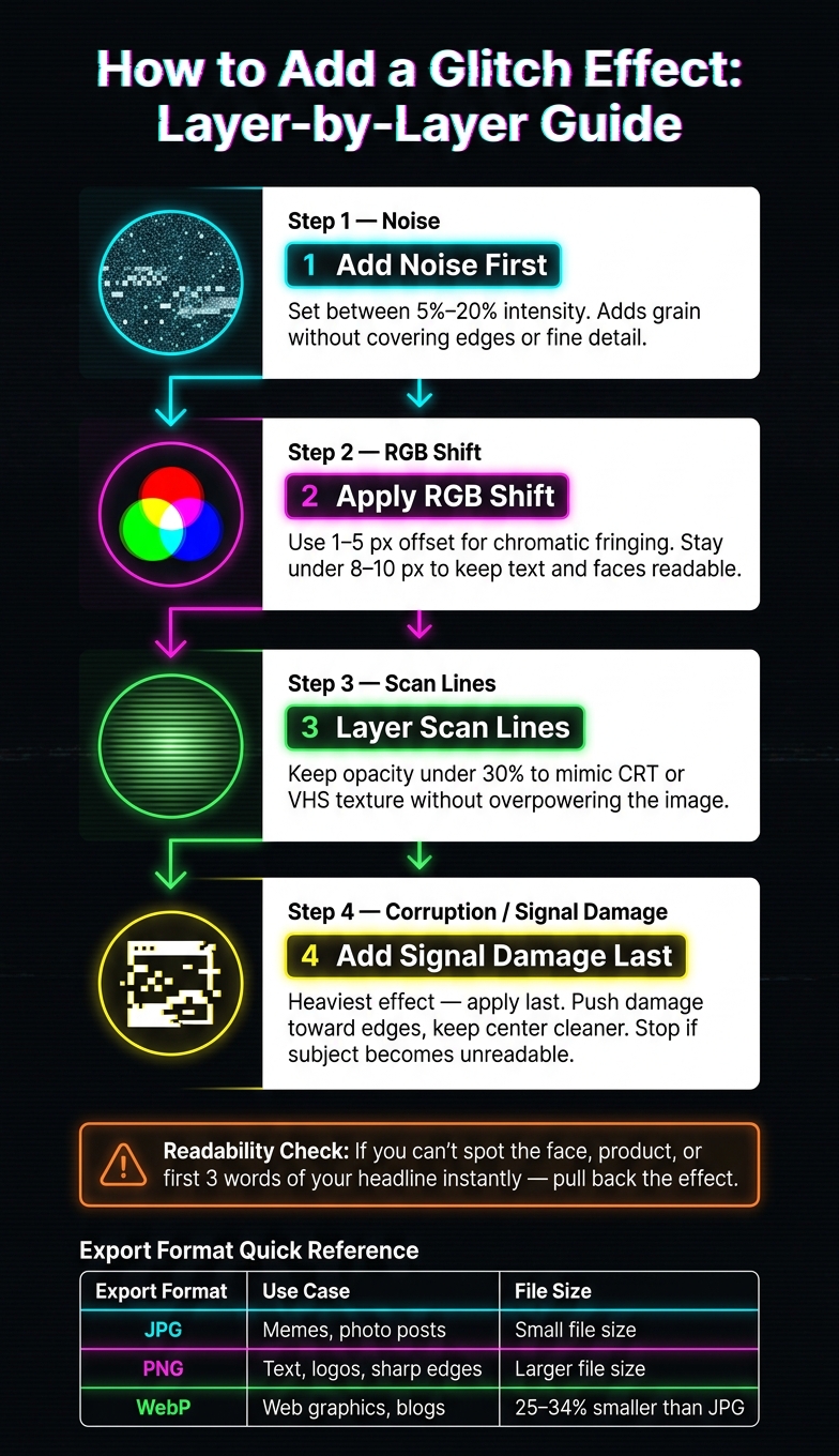
How to Add a Glitch Effect to Images: Step-by-Step Visual Guide
Once your image is ready, open the glitch controls and build the look in layers. In ROCKIMG's glitch tool, upload a JPG or PNG. Your image will show up in the preview pane, and the controls below it let you stack each effect.
There’s one intensity slider for the active effect, from 0% to 100%. You can also turn on noise, blocks, and VHS lines with optional toggles.
Start light. Then add layers until the image looks broken in a good way, while still staying easy to read.
Use this order when building the effect:
Turn on noise and keep it around 5% to 20%. That adds grain across the frame without covering up edges or fine detail.
Next, adjust RGB shift. A 1 to 5 px offset creates colored fringing around edges, which gives you that classic chromatic aberration style. Go past 8 to 10 pixels and outlines start to double. At that point, text and faces can get hard to read, especially on phone-sized screens.
After that, add scan lines at low opacity, under 30%, to mimic CRT or VHS texture. Save corruption for the end. It’s the heaviest effect in the stack. Shifted strips, blocky artifacts, and tearing can take over fast if the lighter layers aren’t set first.
Once the base look is in place, keep the main subject from getting lost. Increase the corruption slider bit by bit, and stop before the focal point starts falling apart.
Here’s a simple rule: if you can’t spot the face, product, or first three words of your headline right away, the effect has gone too far.
Keep the center cleaner and push corruption toward the edges. Check the live preview at full size and as a thumbnail. If the subject still reads clearly in both, you’re in good shape.
Once the glitch look is locked in, export settings decide how much detail sticks around. Your file format shapes both image quality and file size.
JPG works best for photo-based posts and memes. A quality setting between 75–85% keeps the glitch texture visible without making the file larger than it needs to be.
PNG is the better pick when your glitch image includes sharp text, a logo, or crisp geometric edges. That makes it a strong fit for cover art, banners, and other graphics where readability matters.
WebP is the top pick for web graphics that need smaller files. WebP files are often 25–34% smaller than equivalent JPEGs at the same visual quality, which can help pages load faster while keeping the noise and distortion in place.
Match the format to the image’s strongest detail: texture, text, or page speed.
| Format | Best fit | File size |
|---|---|---|
| JPG | Memes, photo posts, retro glitch | Small |
| PNG | Text overlays, logos, sharp edges | Larger |
| WebP | Blogs, headers, web cover art | Smaller at similar quality |
After you choose a format, export at the final pixel size for the layout. Use pixels, and stick with the same dimensions you set during the prep step.
Try to keep files as small as possible without losing scan lines or RGB detail. If you want a lighter file for the web, you can also convert JPG or PNG files to WebP with ROCKIMG's format converter and keep the whole workflow in the browser.
Once the prep is done, the last step is balance. Glitch effects look best when you stack them in layers and keep the subject easy to read. Start with a high-contrast image, then build the effect in this order: noise, RGB shift, scan lines, and signal damage.
After that, use the preview to check if the effect still helps the image instead of burying it. The main mistake is piling on every layer too hard. If the subject gets tough to read, pull it back. If the whole image starts falling apart, reduce the signal damage or scan lines.
Go lighter for posts and thumbnails. Save heavier damage for cover art.
The best glitch effect should look damaged at first glance, but the image should still read right away.
Use a high-contrast image first so the distortion shows up clearly. In the ROCKIMG Glitch Effect tool, test styles like RGB Shift, Scan Lines, or Corruption. Then tweak the intensity, plus optional noise or VHS lines, to dial in the look.
For a cleaner result, mix effects lightly. Heavy glitching plus heavy blur can make the image hard to read.
Start with lower-intensity settings, then increase them little by little. For portraits, keep noise subtle so facial features stay clear.
With glitch effects, a light touch usually works best, especially if you're stacking multiple adjustments. For better clarity, keep noise around 8% to 15% and balance the texture opacity so the image doesn't look too gritty or hide the subject.
ROCKIMG lets you export glitch images as JPG or PNG. The right pick comes down to what you need most: image quality, transparency, or a smaller file.
Both formats work in ROCKIMG, so you can choose the one that fits your final image best.